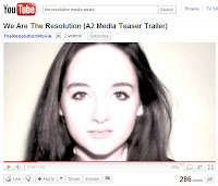
There was a clear awarness to make sure as a group that our brand was obvious and notible. As our teaser trailer went along the lines of a ‘real-life’ cult we wanted our advertising to be all similar and striking enough to know that it was our brand straight away. We knew our audience was probably to be aimed at a 15+ audience and therefore we made the branding less childish and more sophisticated
When looking at our main ancillary tasks we knew that as there was to be a strong link between all three tasks we looked at several factors that effected all three.
TYPOGRAPHY
We experimented with many different kinds of typography. However in the end we decided on the font 'typewriter condensed' from the font website 'dafont' it seemed to have a very sci-fi feel to it, but therefore holds those connotations of conspiracy and suspense that we'd like. It also looks like a lot more modern in the style of typewriter - like old 90's computer font which gives more technological connotations we'd like.
We used the font in all three of our tasks therefore creating a clear sense of connection between all three.
CHARACTER
One of the codes and conventions of psychological thriller is to have a key protagonist and especially in our case we only introduced one key character who may be seen to be our cult leader or the leader of the political broadcast.
We used our actress in all three of our tasks.
TECHNOLOGY IMAGERY
In all of our tasks, especially our trailer itself we gave connotations and ideas of technology throughout. On our website we used a television static background, giving connotations of problems with the ideas of technology involved. In our poster design we used a bright screen with our cult symbol on it to reflect onto our actress' eye. This again gives connotations of a technological cult impacting on the mind through brainwashing. And in our trailer itself we used many short shots involving technology.


