
6, G324 2010: Alexandra Willmott 5155, Lucy Springett 5132, Katharine Smith 5130, Jenna Roberts 4298.
Showing posts with label Research. Show all posts
Showing posts with label Research. Show all posts
Saturday, 11 December 2010

Tuesday, 23 November 2010
Monday, 22 November 2010
Questionnaire
1) What do you expect from a teaser trailer?

2) Decribe your idea of "Cult"
- Rituals
- Creepy
- Religion
- Secretive
- Strange
- Belonging
- Brotherhood
- Controversial
- Deception
- Exploitation
- Gangs
- Hypnotising
- Mind control
- Mysterious
- Sacrifice
- Spooky
- Subliminal messaging
- Dangerous
- Bad
- Scary
- Violent
- Abnormal
- Clever
- Cloaked in secrecy
- Deviant
- Mystery
- Negatively
- Obssesive
- Spooky
- Something to hide
- A climax of action at the end, like a battle
- A plan to reach a specific goal
- A promise
- A way out
- An ending
- Cameras
- Decision
- Determination
- Escape route
- Loose ends being tied
- New beginnings
- The definitive answer
- Solving

6) Why is this?
- Because it is snappy, short and more memorable.
- Because you can interpreate more into one word than a long sentence. a long title also lets the people forget it, whereas a short one stays in their mind
- Easier to say, to the point, ambiguous
- Snappier, easy to remember
- shorter ones are easier to remember but long ones tend to be more original so they can also be very memorable
- Usually gives very little information about the film, making the audience more reliant on the actual footage in the trailer
Monday, 15 November 2010
Research: Typography.

1942 Newspaper: Too creepy? This would be part of all of the cult's advertising campaign and though we want the viewer to be aware of the danger the Resolution hides, the Resolution wouldn't openly advertise this which I think this font does. The slightly eerie typewriter feel, not all quite printed, doesn't fit with our cult's clinically sharp feel, it seems too old fashioned and too creepy.
Old Newspaper: Too thick? Not sure that the title suits being in capitals, it's too much of a statement and again I don't think the typewriter effect works - too old fashioned. The Resolution needs to be modern and contemporary but with an eerie edge.
Typewriter Condensed: In the end, our chosen font. It seems to work much better in lowercase as well - it seems more approachable? The font does seem to be slightly similar to the font of the X Files, it does seem to have a very sci fi feel to it, but therefore holds those connotations of conspiracy and suspense that we'd like. It also looks like a lot more modern in the style of typewriter - like old 90's computer font which gives more technological connotations we'd like.

Orwell: I think this would work well if it were an older cult, it seems like a font you might find in an old book slightly jagged around the edges, but again we wanted something more modern than this.
Dactylographe: Too wide, it seems disproportionate as a font. I think we liked the look of it because we thought it had a modern, computer type feel but it seems obscurely wide and doesn't have that professionalism we wanted.
Telegraphem: This looks like old army font which is completely the wrong connotation we wanted to give off - we wanted to allude to the cult perhaps having ties with the government and military by including shots of protests and an A-bomb but this would set the tone as a predominantly military based film I think.
Monday, 8 November 2010
Blood Splatters

 In our teaser trailer, we are experimenting with having the logo of our cult in blood on a white wall, the dripping effect we'd like it to have should be intensely eerie and we'd like a lingering close up to play on this and the convention of horror that's
 This one looks unrealistic as the colour is too bright and red. The splatter is largely spread and looks like a typical TV gun shot. However the 1st picture is more what we were looking for in our teaser trailer.

Thursday, 4 November 2010
Picking from the archive...
To incorporate this idea of the Resolution being an old conspiracy that's stretched back many, many years and to add to this idea of it's being a constant treat to society, we decided to add in some archive footage. Using crackly, vintage footage should get this across - also, a good way I think to make it seem as if your budget were larger than it actually was and I think people react to shots like these, the crackliness making the actual footage seem all the more real, and eerie that it's been happening for so long.
Jonestown: Massacre News Real
Jim Jones is perhaps the most famous of all cult leaders, creating the notorious People's Temple in the 1970's and then in fact creating his own small village, Jonestown, which culminated in the horrific Jonestown massacre where 909 people committed suicide through arsenic laced KoolAid, 303 of them children. It gained worldwide infamy - mainly for it's absolute unbelievability and atrocity, and we liked this idea of our cult being borne from there's so included vintage footage of him giving a speech to imply this in our readers mind. Perhaps the People's Temple has been lying dormant all this time and adapted into the Resolution? Perhaps they are just inspired by the teachings of Jim Jones? We thought incorporating footage of his teaching would imply he was a figure looked up to by the Resolution at least, an inspiration? He could definately add to the danger we wanted to generate for our cult and how close to the edge this could be to reality - the Jonestown massacre was very real and very tragic. We included footage also of the actual massacre itself, bodies piled up, to show this true reality - the nasty, dangerous side of the cult. We only used brief segments of the News Reel - only three of four seconds, we wanted the Resolution to be its own cult, not in fact the People's Temple, but we liked the connotations it could add, the conspiracy and danger.
Atomic Bomb
We thought the ultimate conspiracy, and time for conspiracy, was obviously the Cold War, so much uncertainty, living in constant threat and fear - technological threat and fear, hopefully like our cult will induce, and we thought linking our cult to that again could add these threatening, edgy connotations. We used a few seconds of the actual A Bomb itself being denotated at the climax of our trailer, hopefully becoming the climax of what our cult could achieve. We still live in threat of bombs and bombings everyday so we thought this would relate all the more to our audience and show the thoughtfulness and relevance of our modern technological cult in our world of terrorism and conflict, and how it could latch on to this and develop.
Jonestown: Massacre News Real
Jim Jones is perhaps the most famous of all cult leaders, creating the notorious People's Temple in the 1970's and then in fact creating his own small village, Jonestown, which culminated in the horrific Jonestown massacre where 909 people committed suicide through arsenic laced KoolAid, 303 of them children. It gained worldwide infamy - mainly for it's absolute unbelievability and atrocity, and we liked this idea of our cult being borne from there's so included vintage footage of him giving a speech to imply this in our readers mind. Perhaps the People's Temple has been lying dormant all this time and adapted into the Resolution? Perhaps they are just inspired by the teachings of Jim Jones? We thought incorporating footage of his teaching would imply he was a figure looked up to by the Resolution at least, an inspiration? He could definately add to the danger we wanted to generate for our cult and how close to the edge this could be to reality - the Jonestown massacre was very real and very tragic. We included footage also of the actual massacre itself, bodies piled up, to show this true reality - the nasty, dangerous side of the cult. We only used brief segments of the News Reel - only three of four seconds, we wanted the Resolution to be its own cult, not in fact the People's Temple, but we liked the connotations it could add, the conspiracy and danger.
Atomic Bomb
We thought the ultimate conspiracy, and time for conspiracy, was obviously the Cold War, so much uncertainty, living in constant threat and fear - technological threat and fear, hopefully like our cult will induce, and we thought linking our cult to that again could add these threatening, edgy connotations. We used a few seconds of the actual A Bomb itself being denotated at the climax of our trailer, hopefully becoming the climax of what our cult could achieve. We still live in threat of bombs and bombings everyday so we thought this would relate all the more to our audience and show the thoughtfulness and relevance of our modern technological cult in our world of terrorism and conflict, and how it could latch on to this and develop.
Monday, 1 November 2010
The Resolution Symbol.

After many an afternoon doodling, this was the logo we finally decided on.
The eye was taken from an old Egyptian Hieroglyphic of the Sun God 'Ra' which fascinated us and we liked the connotations the eye held in today's society.
That idea of 'being watched' and 'being controlled' - the constant surveillance around us, CCTV, cameras, is this the government, the cult? We thought it had an Orwell 1984 type vibe also, that everything you do is watched and noted, that 'they' are in complete control of your life and everything you do, that paranoia of stepping out of the line and the repurcussions it could hold. There's definately something very ominous about it baring down over you, and the eye in itself does hold Biblical connotations - the eye of God, for example.
We also thought the eye alluded to this idea of 'seduction', of almost flirtatiousness, that the cult is luring you in and 'seducing' you.
Some say that eyes are the 'window to the soul' and that therefore they are the most honest part of you, that they can't lie so we combined this with the spikes below the eye - again three as a Biblical connotation, the Father, the Son and the Holy Spirit, but the spikes represent danger, that you can see into the cult's soul but you'd get hurt if you were to try and touch it, or into serious danger.
Wednesday, 20 October 2010
Inspiration: Communist Propaganda
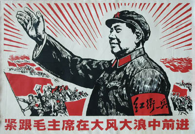 For our poster we began looking to this idea of political posters and this idea of recruiting people through propaganda, specifically Communist propaganda. I don't think cults have too much propaganda, because generally their cults revolve around some level of illegality I'm not sure they're allowed to advertise quite as overtly as political parties who set up huge, costly advertising campaigns and we looked back to old dictatorships who used brainwashing in much the same way cults did. In the Communist posters we looked at, we were inspired by their use of images and symbols and words, as opposed to photographs - colour schemes seemed to be particularly important, most of the Communist propaganda being heavily dominated by red. I think repetition and this idea of subliminal messaging is key - repeating slogans, symbols - the first is quite predominant in these posters, and relaying and relaying them until they're inside people's heads.
Tuesday, 19 October 2010
INSPIRATION: The Event
http://www.guardian.co.uk/tv-and-radio/video/2010/sep/20/channel-4-the-event
We liked the editing of this trailer, and also the way Channel 4 were building it up, keeping it mysterious and elusive and revealing nothing of the plot, but hyping it up and building so much tension around it.
We liked the editing of this trailer, and also the way Channel 4 were building it up, keeping it mysterious and elusive and revealing nothing of the plot, but hyping it up and building so much tension around it.
Friday, 15 October 2010
Website Design
Website design is judged on five different areas;
Design
Content
Overall Effectiveness
operational effectiveness, communication effectiveness
Functionality
cultural awareness, text, download codes, interaction times, LEGALITY -copyright and intellectual property
Design
graphic design, typography, visual elements (attracting people to the general design from the sight), user friendly, aesthetics, proffessionalism (quality of finish), use of colour (or not), layout
Content
purpose (links, attachments), interactivity, verbal expression
Originality
creativity, distinction - multi sensory and emotional expression, predictive research
Originality
creativity, distinction - multi sensory and emotional expression, predictive research
Overall Effectiveness
operational effectiveness, communication effectiveness
INSPIRATION: Whitechapel Intro
Using inspiration from the intro - up to 00:57, the old archive shots integrated into the intro, the old, vintagey looking footage of notes, propaganda, maps, landmarks, people etc. Using shots like these in our own trailer will make the cult look as if it's well founded, as if it's been around for years, perhaps even a conspiracy laying unnoticed beneath history making it seem all the more dangerous and real. Obviously there are copyright issues in using other people's old footage so we will have to trail through our parent's and grandparent's old films or find a way to give new footage we can collect the same vintagey feel.
I think the editing in the intro is very clever - using flares of lights and reflections to transition between shots and the slowing down and distortions. One shot I find particularly effective is the shot at roughly 00:46 where the camera is between four men's shoulders, all dark and suited at night walking along a street and the handheld quality of this shot moving up and down with the rhythm of their walking.
Thursday, 14 October 2010
Blood recipes!
RECIPES:
1) Add blue and red food colouring to a small amount of golden syrup. Add 1/2 tsp flour and stir thoroughly.
THICKENERS:
Dry thickener:
1) Add sifted flour and gently mix. If small lumps form, wait for them to rise to the top and then remove.
Wet thickener:
1) Stir in chocolate syrup until the desired consistency is reached. Let the mixture sit for 10 minutes in a warm place so it has time to thicken.
2) Put some hair gel (water soluble) for the amount of blood you want. Add red food colouring and a small amount of chocolate syrup. Add a small amount of hand sanitizer until right consistency is reached.

1) Add blue and red food colouring to a small amount of golden syrup. Add 1/2 tsp flour and stir thoroughly.
THICKENERS:
Dry thickener:
1) Add sifted flour and gently mix. If small lumps form, wait for them to rise to the top and then remove.
Wet thickener:
1) Stir in chocolate syrup until the desired consistency is reached. Let the mixture sit for 10 minutes in a warm place so it has time to thicken.
2) Put some hair gel (water soluble) for the amount of blood you want. Add red food colouring and a small amount of chocolate syrup. Add a small amount of hand sanitizer until right consistency is reached.
 |
| This is the red food colouring dripped into water, it gives an interesting swirling effect! |
 |
| Mixing hair gel into red and green food colouring, trying to build a consistency. |
 |
| Testing the blood onto skin to see how the colour contrasted against skin and the realism of the consistency. |
 |
| Added a small amount of cocoa powder for a more realistic, darker colour. |
 |
| This one is simply the green and red food colouring with just water and cocoa powder, it comes out darker against the skin. |

 |
| Testing out dripping the blood. |
 |
| Attempting to create the symbol from the blood. The absorbency of the tissue meant it started to spread and clot slightly. Against a harder surface like perhaps a white board or porcelain it should retain shape and drip down more realistically. |
Monday, 11 October 2010
INSPIRATION: Scooby Doo, cult video
In this clip, though not the horror context of film we'd like to create, there is an example of a cult-esque video, with a patronising news reporter type woman, the kind we'd like to emulate.
TYPOGRAPHY

Clear Stand-out Clarity Text Emotions Genre
Typography is about the font, colour and degign of the text and how it can prevoke emotions and give ideas to the audience.
Typography can also be creative and artistic.
Typography can also introduce the idea of being 'confusing on purpose'
Sunday, 10 October 2010
Wednesday, 6 October 2010
Research: Lighting.
- Revelation of form: Altering the perception of shapes, particularly three-dimensional stage elements.
- Focus: Directing the audience's attention to an area or distracting them from another.
- Mood: Setting the tone of a scene. Harsh red light has a totally different effect than soft lavender light.
- Location and time of day: Establishing or altering position in time and space. Blues can suggest night time while orange and red can suggest a sunrise or sunset. Use of gobos to project sky scene, moon etc.
- It is measured in lux, lumens and foot-candles.
- Colour temperature is measured in kelvins. The colour of a light is determined by the gel colour given to it, but also in part by the power level the lamp is being run at and the colour of material it is to light.
- LED fixtures create colour through additive colour mixing with red, green, and blue LEDs at different intensities. This type of colour mixing is also used frequently with borderlights.
- Pattern refers to the shape, quality and evenness of a lamp's output. There are 3 factors, firstly the specifics of the lamps reflector and lens assembly, different sizes and shapes of reflector and the nature of the lens being used can all affect the pattern of light. Secondly, how the lamp is focused affect its pattern. Lastly, a gobo or break up pattern may be applied to ERSs and similar instruments. This is typically a thin sheet of metal with a shape cut into it. It is inserted into the instrument near its aperture.
- The final focus should place the "hot spot" of the beam at the actor's head level when standing at the center of the instrument's assigned "focus area".
- Stanley McCandless was the first to define controllable qualities of light used in theater. In A Method for Lighting the Stage, he discusses colour, distribution, intensity and movement as the qualities that can be manipulated by a lighting designer to achieve the desired visual, emotional and thematic look. This is widely embraced today, the method involves lighting an object on the stage from three angles—2 lights at 45 degrees to the left and right, and one at 90 degrees
- A Fresnel is a type of wash light and has the final optical device within the chain.
- A typical moving light allows the designer to control the position, colour, shape, and strobing of the light beam created. Moving lights are also often used instead of having a large number of "generic" lights. This is because one moving light can do the work of several generics.


Subscribe to:
Posts (Atom)