

6, G324 2010: Alexandra Willmott 5155, Lucy Springett 5132, Katharine Smith 5130, Jenna Roberts 4298.
Thursday, 21 October 2010
Wednesday, 20 October 2010
"To me death is not a fearful thing. It's living that's cursed."
 "As early as age 18 when he watched his then idol Mao Zedong overthrow the Chinese government, Jim Jones realized that the way to achieve social change through Marxism in the United States was to mobilize people through religion." - Marceline Jones
WHO IS HE?
Jim Jones, the leader of the People's Temple, born May 13, 1931, died November 18, 1978, as instigator of the Jonestown massacre, a mass murder of over 909 people, the second greatest single loss of American civilian life in a non-natural disaster in American history, behind just 9/11. Jim Jones, a manipulative and yet highly intelligent man, within his life time, single handedly created one of the most notorious and deadly cults - the People's Temple, creating even his own village, 'Jonestown' - a 'sanctuary' and 'social paradise' as he dubbed it, of which nobody was allowed to leave and abuse - sexual, physical, psychological seemed to thrive, as well as his own drug addiction and psychological paranoia, as his members remained brainwashed and enthralled by his magnetism and powerful leadership, but in lethal danger. In a time when racism was rife, he travelled through America setting up interracial churches and organizing anti racist rallies, attended by prevalent politicians of the time such as Harvey Milk, and even helping rebuild slums in Rio de Janeiro - perhaps how he first began to establish himself as this revolutionary he imagined himself, but was always harbouring an unhealthy extremism, idolizing Communist leaders and fascinating over death and religion as a child, fantasizing about the domination of America through Marxism - his infiltration of the church being part of his plan to instigate this. These obscure fascinations, his paranoia and psychological complexities combined with his extreme Communist principles and a drug addiction culminated in the People's Temple and the eventual Jonestown massacre - high on LSD and marijuana, he convinced his followers that fascist forces were coming to convert their children, that they would parachute down and torture them all and that they should commit not suicide, but 'revolutionary suicide,' protesting the conditions of the inhumane world they lived in and 909 people, 303 children, drank the cyanide laced Kool Aid he had prepared, dying minutes after in their 'sanctuary' province in Guyana.
We incorporated a few seconds of the above footage of Jim Jones, raising his arms after he'd finished a speech, literally two or three seconds because we felt this was all we needed to make the statement we wanted - to allude to the real threat of cults, the manipulation and psychological control they exercise, the very real danger they can present - and we thought incorporating some archive footage of him could imply not only that our cult was deeply ingrained into history, perhaps that it was some incredibly current reworking of an old cult that had been brewing underground or suddenly reappeared, but that it had the power and the weight of Jim Jones, probably the most powerful and manipulative cult leader that has occured, behind it. In the same way Jim Jones played on the politics of his day - racism being the key issue, as well as Communism and this idea of an equal, unoppressed society and the fears these instilled into people, we wanted our cult to play on the fears of present day - the ever present threat of terrorism, the threats of the internet, of the two combined, cyber terrorism etc. and we wanted to really induce a sense of paranoia and fear that we thought Jim Jones could inspire.
We incorporated a few seconds of the above footage of Jim Jones, raising his arms after he'd finished a speech, literally two or three seconds because we felt this was all we needed to make the statement we wanted - to allude to the real threat of cults, the manipulation and psychological control they exercise, the very real danger they can present - and we thought incorporating some archive footage of him could imply not only that our cult was deeply ingrained into history, perhaps that it was some incredibly current reworking of an old cult that had been brewing underground or suddenly reappeared, but that it had the power and the weight of Jim Jones, probably the most powerful and manipulative cult leader that has occured, behind it. In the same way Jim Jones played on the politics of his day - racism being the key issue, as well as Communism and this idea of an equal, unoppressed society and the fears these instilled into people, we wanted our cult to play on the fears of present day - the ever present threat of terrorism, the threats of the internet, of the two combined, cyber terrorism etc. and we wanted to really induce a sense of paranoia and fear that we thought Jim Jones could inspire.
Inspiration: Communist Propaganda
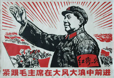 For our poster we began looking to this idea of political posters and this idea of recruiting people through propaganda, specifically Communist propaganda. I don't think cults have too much propaganda, because generally their cults revolve around some level of illegality I'm not sure they're allowed to advertise quite as overtly as political parties who set up huge, costly advertising campaigns and we looked back to old dictatorships who used brainwashing in much the same way cults did. In the Communist posters we looked at, we were inspired by their use of images and symbols and words, as opposed to photographs - colour schemes seemed to be particularly important, most of the Communist propaganda being heavily dominated by red. I think repetition and this idea of subliminal messaging is key - repeating slogans, symbols - the first is quite predominant in these posters, and relaying and relaying them until they're inside people's heads.
Tuesday, 19 October 2010
Make Up Trial #2.
Channeling news reporters and political leaders flawless appearence we created a make-up trial on one of our team members; Lucy.
INSPIRATION: The Event
http://www.guardian.co.uk/tv-and-radio/video/2010/sep/20/channel-4-the-event
We liked the editing of this trailer, and also the way Channel 4 were building it up, keeping it mysterious and elusive and revealing nothing of the plot, but hyping it up and building so much tension around it.
We liked the editing of this trailer, and also the way Channel 4 were building it up, keeping it mysterious and elusive and revealing nothing of the plot, but hyping it up and building so much tension around it.
Monday, 18 October 2010
Green Screen Test #3
We tried a third green screen test with our actress Lauren Bradley. We tried using a moving background, however we decided that it may be distracting of attention away from Lauren and her speech - also, this particular background didn't loop so effortlessly, after about six seconds of zooming in, it would snap back to it's original position so we needed something that we could have on a continuous loop. We also made sure that our actress' make up and hair was flawless preventing the light problems we'd previously had and smoothed down her fly-away hairs, which previously the greenscreen hadn't quite permeated, leaving a sort of green halo around her head. The key issue with this was the noise in the background - I think an extractor fan, which we hadn't realized was quite so prominent when filming, but the blue of the background brings out quite a lot of red in Lauren's skin and we want her to have a very pale, perfect, almost clinical feel. We experimented at the end with having her greenscreened on top of herself which though gave a quite cool, trippy sort of effect - again the flyaway hairs corrupted the image behind.
The Resolution: Viral
We liked this idea of taking our cult online, its expanding and spreading through the internet like a virus and brainwashing users, and created this super short viral video out of all the off cuts of footage we had. We didn't want it to reveal anything about the movie or the actual trailer, just to set out a tease about the cult - symbols, the static we'd used in the original trailer, and then used for the background of our website, some extra shots of Jim Jones giving a speech we'd taken off of YouTube, and of Lauren from our main filming shoot - we adjusted the exposure on all of them and whitened them all out to give them this eerie, clinical feel. We wanted it to be super short, we felt 22 seconds was long enough to create a tease but short enough to catch the viewer's attention, and keep it, before realizing what it was and switching it off. We could imagine it being a pop up, literally popping up on people's screens over websites and again incorporated this idea of subliminal messaging - the slogan, the Resolution, the date flashing up, constantly being reiterated into the viewer's mind. We added a short soundtrack - an eerie low sound, almost like a very low horn or breathing and I think it was effective, just creepy enough to unsettle you and imprint itself on your mind.
WEBSITE: The Grudge

The moving DVD and title is slightly disorientating, which helps convey the horror genre of the film. The typography is in spaced red letters making it easily legible. The links are to the left of the picture and again easy to read, however they have used a different font which works well with the other forms of typography.
The links are easy to follow and promote the film as it offers the audience the chance to order the film directly from the website.
The picture on the right is dimly lit with half of the actress' face in shadows. She is looking directly into the camera and her facial expression portrays her being scared. She has a white jumper which has connotations of innocence and purity suggesting she is the victim.
Friday, 15 October 2010
Website Design
Website design is judged on five different areas;
Design
Content
Overall Effectiveness
operational effectiveness, communication effectiveness
Functionality
cultural awareness, text, download codes, interaction times, LEGALITY -copyright and intellectual property
Design
graphic design, typography, visual elements (attracting people to the general design from the sight), user friendly, aesthetics, proffessionalism (quality of finish), use of colour (or not), layout
Content
purpose (links, attachments), interactivity, verbal expression
Originality
creativity, distinction - multi sensory and emotional expression, predictive research
Originality
creativity, distinction - multi sensory and emotional expression, predictive research
Overall Effectiveness
operational effectiveness, communication effectiveness
INSPIRATION: Whitechapel Intro
Using inspiration from the intro - up to 00:57, the old archive shots integrated into the intro, the old, vintagey looking footage of notes, propaganda, maps, landmarks, people etc. Using shots like these in our own trailer will make the cult look as if it's well founded, as if it's been around for years, perhaps even a conspiracy laying unnoticed beneath history making it seem all the more dangerous and real. Obviously there are copyright issues in using other people's old footage so we will have to trail through our parent's and grandparent's old films or find a way to give new footage we can collect the same vintagey feel.
I think the editing in the intro is very clever - using flares of lights and reflections to transition between shots and the slowing down and distortions. One shot I find particularly effective is the shot at roughly 00:46 where the camera is between four men's shoulders, all dark and suited at night walking along a street and the handheld quality of this shot moving up and down with the rhythm of their walking.
Thursday, 14 October 2010
Blood recipes!
RECIPES:
1) Add blue and red food colouring to a small amount of golden syrup. Add 1/2 tsp flour and stir thoroughly.
THICKENERS:
Dry thickener:
1) Add sifted flour and gently mix. If small lumps form, wait for them to rise to the top and then remove.
Wet thickener:
1) Stir in chocolate syrup until the desired consistency is reached. Let the mixture sit for 10 minutes in a warm place so it has time to thicken.
2) Put some hair gel (water soluble) for the amount of blood you want. Add red food colouring and a small amount of chocolate syrup. Add a small amount of hand sanitizer until right consistency is reached.
 |
| This is the red food colouring dripped into water, it gives an interesting swirling effect! |
 |
| Mixing hair gel into red and green food colouring, trying to build a consistency. |
 |
| Testing the blood onto skin to see how the colour contrasted against skin and the realism of the consistency. |
 |
| Added a small amount of cocoa powder for a more realistic, darker colour. |
 |
| This one is simply the green and red food colouring with just water and cocoa powder, it comes out darker against the skin. |

 |
| Testing out dripping the blood. |
 |
| Attempting to create the symbol from the blood. The absorbency of the tissue meant it started to spread and clot slightly. Against a harder surface like perhaps a white board or porcelain it should retain shape and drip down more realistically. |
Wednesday, 13 October 2010
Green Screen #2
We attempted to the green screen a second time, but with a few modifications to correct what did not work so well last time.
Firstly we filmed it with a dark room and lit it manually using lamps and spotlights, to create more artificial lighting in comparison to last time where it was within a room lit by daylight and general room lighting. The second attempt definitely worked a lot better.
Green Screen Test #1
From this filming we will know what do try to achieve next time:
- matte makeup on our actresses face.
- lighting, all over equal
- larger greenscreen
- an appropriate greenscreen background.
Monday, 11 October 2010
INSPIRATION: Scooby Doo, cult video
In this clip, though not the horror context of film we'd like to create, there is an example of a cult-esque video, with a patronising news reporter type woman, the kind we'd like to emulate.
TYPOGRAPHY

Clear Stand-out Clarity Text Emotions Genre
Typography is about the font, colour and degign of the text and how it can prevoke emotions and give ideas to the audience.
Typography can also be creative and artistic.
Typography can also introduce the idea of being 'confusing on purpose'
Sunday, 10 October 2010
Thursday, 7 October 2010
WEBSITE: Harry Potter and the Deathly Hallows

The typography on the website is iconic to the films "IT ALL ENDS HERE". The title has been shortend to HP7, in a grey colour as the movie has become dark and for an older audience than the first film.
The fire in Hogwarts is animated along with the smoke which makes the website feel more realistic and draws in the audience as they have carefully designed it to fit with the film.
At the bottom of the page you have to hover for credits as they have been hidden from the first glance so you can focus on the picture of burning Hogwarts and the reflection in the lake.
The facebook and twitter icons are also at the bottom of the website page showing that is relation to a modern and wider audience.
WEBSITE: The Killer Inside Me

The thing I find particularly interesting about this website is the animation featured - the smoke from Lou Ford's cigar chugs and swirls about the screen ominously. The site is easily navigatable, I also think it's interesting the way they've created a Twitter account for the main character himself, as if he were a real person, and I think it's an effective but understated website. I wouldn't say the genre was particularly clear but having the darkness surrounding the character, dimming into the corners and then these flashes of bright colour as if everything is flying past while he is calmly sat smoking his cigar, definately adds an eerie and psychological edge and is certainly intriguing. I think it's simplicity and vagueness are what make it so effective and you can after all, see the name of the film and it's director very clearly, as well as all other links.
http://www.killerinsideme.com/
http://www.killerinsideme.com/
Wednesday, 6 October 2010
Research: Lighting.
- Revelation of form: Altering the perception of shapes, particularly three-dimensional stage elements.
- Focus: Directing the audience's attention to an area or distracting them from another.
- Mood: Setting the tone of a scene. Harsh red light has a totally different effect than soft lavender light.
- Location and time of day: Establishing or altering position in time and space. Blues can suggest night time while orange and red can suggest a sunrise or sunset. Use of gobos to project sky scene, moon etc.
- It is measured in lux, lumens and foot-candles.
- Colour temperature is measured in kelvins. The colour of a light is determined by the gel colour given to it, but also in part by the power level the lamp is being run at and the colour of material it is to light.
- LED fixtures create colour through additive colour mixing with red, green, and blue LEDs at different intensities. This type of colour mixing is also used frequently with borderlights.
- Pattern refers to the shape, quality and evenness of a lamp's output. There are 3 factors, firstly the specifics of the lamps reflector and lens assembly, different sizes and shapes of reflector and the nature of the lens being used can all affect the pattern of light. Secondly, how the lamp is focused affect its pattern. Lastly, a gobo or break up pattern may be applied to ERSs and similar instruments. This is typically a thin sheet of metal with a shape cut into it. It is inserted into the instrument near its aperture.
- The final focus should place the "hot spot" of the beam at the actor's head level when standing at the center of the instrument's assigned "focus area".
- Stanley McCandless was the first to define controllable qualities of light used in theater. In A Method for Lighting the Stage, he discusses colour, distribution, intensity and movement as the qualities that can be manipulated by a lighting designer to achieve the desired visual, emotional and thematic look. This is widely embraced today, the method involves lighting an object on the stage from three angles—2 lights at 45 degrees to the left and right, and one at 90 degrees
- A Fresnel is a type of wash light and has the final optical device within the chain.
- A typical moving light allows the designer to control the position, colour, shape, and strobing of the light beam created. Moving lights are also often used instead of having a large number of "generic" lights. This is because one moving light can do the work of several generics.
Monday, 4 October 2010
WEBSITE: Case 39

This is the simplistic website for the new horror film 'Case 39'. This website has a very simplistic design, similar to one we would make if we were to make a website ourselves.
The trailer appears as soon as one enters the site and the title is clear and glowing. Also the links are simplistic and clear at the bottom of the page using only key words and logos. The actors are also a pull for the film as they are one of the main focus' apart from the title.
Friday, 1 October 2010
WEBSITE: Wallstreet: Money Never Sleeps
http://www.wallstreetmoneyneversleeps.com/
A great website in which the movie trailer itself is intergrated behind the features for the website, forcing the viewer to watch the trailer subconciously.
A great website in which the movie trailer itself is intergrated behind the features for the website, forcing the viewer to watch the trailer subconciously.
Subscribe to:
Posts (Atom)