Sunday 28 November 2010

Website Proposal.


Another idea regarding website proposals was to keep quite a simple and linear look to the design, whilst still leaving the viewer curious and intrigued to see what the website may be all about.
Although this is just a basic outline, we wanted to see what effect could be created by just placing in the basic requirements of both the website and also our cult, this so being the title, the logo and the proposed tagline. 
The website is animated and the two seperate pieces of the tagline slide in from the left in linear one after the other. The logo is then overlayed with the trailer video from youtube for the viewer to watch.
Other aspects that would be interesting to add to the website would be to have a button where the user can physically touch to 'join us now'. Another would be to have an RSS feed detailing every new person that joins the cult, such as ''John Smith has now joined The Resolution. Welcome John'', to imply it is a real, live and ongoing cult.
Having used wix to produce this website, we feel it is the most appropriate and effective website to use, and after further practice to make ourselves more knowledgeable of the different effects and things we can do with the website, hopefully we can make a clever and effective website.

Wednesday 24 November 2010

Website Proposal #2

Again a simple idea, the trailer would go bottom right of the page. The background is in the style of the matrix, and is relevent to our trailer as it is filled with symbols and letters which we managed to get to move. The tagline for our trailer was "Join Us Now" which we included in the website design. The typography in this design is hard to read over the moving letters and symbols of the background.

Website Proposal #3

This is just a template idea, the teaser trailer would go in the centre left. This idea was a very basic idea with the facebook, twitter and blogger logos. The picture background was taken from the website Wix, and was chosen to represent a contained area and a possibility of danger. The red typography incorporates the conventions of a psychological thriller.

Monday 22 November 2010

Questionnaire

1) What do you expect from a teaser trailer?


2) Decribe your idea of "Cult"
  • Rituals
  • Creepy
  • Religion
  • Secretive
  • Strange
  • Belonging
  • Brotherhood
  • Controversial
  • Deception
  • Exploitation
  • Gangs
  • Hypnotising
  • Mind control
  • Mysterious
  • Sacrifice
  • Spooky
  • Subliminal messaging
3) How are "Cults" portrayed in the media?
  • Dangerous
  • Bad
  • Scary
  • Violent
  • Abnormal
  • Clever
  • Cloaked in secrecy
  • Deviant
  • Mystery
  • Negatively
  • Obssesive
  • Spooky
  • Something to hide
4) What does "The Resolution" make you think of?
  • A climax of action at the end, like a battle
  • A plan to reach a specific goal
  • A promise
  • A way out
  • An ending
  • Cameras
  • Decision
  • Determination
  • Escape route
  • Loose ends being tied
  • New beginnings
  • The definitive answer
  • Solving
5) Do you think shorter titles are more effective?

6) Why is this?
  • Because it is snappy, short and more memorable.
  • Because you can interpreate more into one word than a long sentence. a long title also lets the people forget it, whereas a short one stays in their mind
  • Easier to say, to the point, ambiguous
  • Snappier, easy to remember
  • shorter ones are easier to remember but long ones tend to be more original so they can also be very memorable
  • Usually gives very little information about the film, making the audience more reliant on the actual footage in the trailer

Friday 19 November 2010

Poster designs

This is a basic design of a poster. It includes symbols for the background, which makes the overall poster look crowded. I decided to put our logo in the middle to convey its importance, and to show that this symbol means The Resolution, the jagged edges are to portray that nothing is simple, everything has its pros and cons.
The blood drips are to portray the effects that surround the cult, and we are the only safe place. The typography is simple, but it is hard to read over the symbols.

Monday 15 November 2010

Research: Typography.

1942 Newspaper: Too creepy? This would be part of all of the cult's advertising campaign and though we want the viewer to be aware of the danger the Resolution hides, the Resolution wouldn't openly advertise this which I think this font does. The slightly eerie typewriter feel, not all quite printed, doesn't fit with our cult's clinically sharp feel, it seems too old fashioned and too creepy.

Old Newspaper: Too thick? Not sure that the title suits being in capitals, it's too much of a statement and again I don't think the typewriter effect works - too old fashioned. The Resolution needs to be modern and contemporary but with an eerie edge.

Typewriter Condensed: In the end, our chosen font. It seems to work much better in lowercase as well - it seems more approachable? The font does seem to be slightly similar to the font of the X Files, it does seem to have a  very sci fi feel to it, but therefore holds those connotations of conspiracy and suspense that we'd like. It also looks like a lot more modern in the style of typewriter - like old 90's computer font which gives more technological connotations we'd like.


Orwell: I think this would work well if it were an older cult, it seems like a font you might find in an old book slightly jagged around the edges, but again we wanted something more modern than this.

Dactylographe: Too wide, it seems disproportionate as a font. I think we liked the look of it because we thought it had a modern, computer type feel but it seems obscurely wide and doesn't have that professionalism we wanted.

Telegraphem: This looks like old army font which is completely the wrong connotation we wanted to give off - we wanted to allude to the cult perhaps having ties with the government and military by including shots of protests and an A-bomb but this would set the tone as a predominantly military based film I think.

Tuesday 9 November 2010

Location

These are the pictures from a location in the outskirts of Tunbridge Wells. We found a perfect location with a Pill Box next to a corn field.

 This is the Pill Box, the inside had scraps of wood and was a bit damp from small leaks in the ceiling, which had an interesting and creepy effect which would have matched the conventions of a Horror trailer.


 The corn fields were good for our original idea of a chase. We tried filming Lucy running down the gap in the field to test different angles.
This location had a lot of fields and a lake which crossed a few of them. The day we went was sunny which made the location seem more appealing and because it was picturesque, it meant that it would be able to use it to subvert conventions of the genre.

We decided not to choose this location as we were focusing more on technology which obviously our location didn't have. We decided to use a location that had a variety of different technologies and access to different types of lighting we could use as well as a look of cleanliness for Lauren's scene which makes the clip look staged and set up on a small budget which of course is what our Cult would be like.

Monday 8 November 2010

Blood Splatters


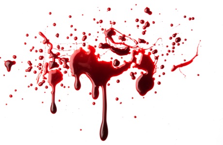
In our teaser trailer, we are experimenting with having the logo of our cult in blood on a white wall, the dripping effect we'd like it to have should be intensely eerie and we'd like a lingering close up to play on this and the convention of horror that's
This is an example of written words in blood on a wall. This one is not as effective as the colour is too red and it looks more 2D. However taking the basic ideas of both the above we should be able to create a realistic logo for our trailer.

This one looks unrealistic as the colour is too bright and red. The splatter is largely spread and looks like a typical TV gun shot. However the 1st picture is more what we were looking for in our teaser trailer.

Sunday 7 November 2010

Orphan Poster

The white capital typography is simple and easy to read as the letters are evenly spaced. The font and white colour implies innocence and simplicity.
The picture is centre of the poster and her face is lit up creating a shadow behind her. She is wearing her hair in pigtails with ribbon which conveys youth and innocence.

She is looking directly into the camera and has a serious facial expression. This picture implies a horror film as the girl's face is blank and the red velvet ribbon around her neck showing she is hiding something.

The girl has neat hair and clothes showing she is maybe controlling as children are usually untidy especially their hair.
The clothes don't look modern showing she is unique and followers her own opinions.

The title typography looks like a child's handwriting scratched or marked forcefully into the paper, it has random Capitalisation which also implies youth.

Friday 5 November 2010

Green Screen Alternative

We used different lighting techniques such as 3-point lighting, to enable us to edit the footage on imovie. However once we started to edit, we realised that there was always a section of Lauren's face that was more brightly lit than the rest meaning that when we put a different background up, some of the face became invisible.

Although the Green Screen did not work for us, it allowed us to explore different techniques and ideas of how to portray and make our teaser trailer. We learnt that to make this work we would need the specific lighting equipment rather than using equipment that we already had.

After several attempts, we gave up on the Green Screen, as we could never seem to get the lighting perfect and therefore decided to adapt the Green Screening idea, and change the contrast in the colours of the clip. We changed it so that it was brightly white portraying the cleanliness of our cult and film. By changing the contrast, we created a scene equally as believable as if we had used a Green Screen, if actually better.

Thursday 4 November 2010

Second storyboard.


Picking from the archive...

To incorporate this idea of the Resolution being an old conspiracy that's stretched back many, many years and to add to this idea of it's being a constant treat to society, we decided to add in some archive footage. Using crackly, vintage footage should get this across - also, a good way I think to make it seem as if your budget were larger than it actually was and I think people react to shots like these, the crackliness making the actual footage seem all the more real, and eerie that it's been happening for so long.

Jonestown: Massacre News Real


Jim Jones is perhaps the most famous of all cult leaders, creating the notorious People's Temple in the 1970's and then in fact creating his own small village, Jonestown, which culminated in the horrific Jonestown massacre where 909 people committed suicide through arsenic laced KoolAid, 303 of them children. It gained worldwide infamy - mainly for it's absolute unbelievability and atrocity, and we liked this idea of our cult being borne from there's so included vintage footage of him giving a speech to imply this in our readers mind. Perhaps the People's Temple has been lying dormant all this time and adapted into the Resolution? Perhaps they are just inspired by the teachings of Jim Jones? We thought incorporating footage of his teaching would imply he was a figure looked up to by the Resolution at least, an inspiration? He could definately add to the danger we wanted to generate for our cult and how close to the edge this could be to reality - the Jonestown massacre was very real and very tragic. We included footage also of the actual massacre itself, bodies piled up, to show this true reality - the nasty, dangerous side of the cult. We only used brief segments of the News Reel - only three of four seconds, we wanted the Resolution to be its own cult, not in fact the People's Temple, but we liked the connotations it could add, the conspiracy and danger.

Atomic Bomb


We thought the ultimate conspiracy, and time for conspiracy, was obviously the Cold War, so much uncertainty, living in constant threat and fear - technological threat and fear, hopefully like our cult will induce, and we thought linking our cult to that again could add these threatening, edgy connotations. We used a few seconds of the actual A Bomb itself being denotated at the climax of our trailer, hopefully becoming the climax of what our cult could achieve. We still live in threat of bombs and bombings everyday so we thought this would relate all the more to our audience and show the thoughtfulness and relevance of our modern technological cult in our world of terrorism and conflict, and how it could latch on to this and develop.

Tuesday 2 November 2010

Final draft of beginning speech.

We wanted this speech to be very cleverly worded, devious and slightly manipulative, with double entendres and such – I think we wanted to appeal to a higher intellectual capacity of viewer, one that might see through our spinning and be aware of the conspiracies and dangers we were trying to allude to. We eventually had to cut it down – we didn’t want it to be speech heavy as we didn’t want to lose our viewer’s attention so intercut with visual images to lay down this idea of subliminal messaging and keep the viewer alert:

I am going to offer you a truth, an upsetting, distressing and indeclinable truth. This truth is of the evil of this modern world, the wave of sin that washed through it and that you are drowning in. The corruption and insatiable depravity of man that slowly consumes you. I do not say this to frigthen you, I say this because we wish to help you. We can save you and your soul. Join us and we can offer you a new truth. We are the Resolution. We are the answer, the only answer.

Monday 1 November 2010

The Resolution Symbol.

After many an afternoon doodling, this was the logo we finally decided on.
The eye was taken from an old Egyptian Hieroglyphic of the Sun God 'Ra' which fascinated us and we liked the connotations the eye held in today's society.
That idea of 'being watched' and 'being controlled' - the constant surveillance around us, CCTV, cameras, is this the government, the cult? We thought it had an Orwell 1984 type vibe also, that everything you do is watched and noted, that 'they' are in complete control of your life and everything you do, that paranoia of stepping out of the line and the repurcussions it could hold. There's definately something very ominous about it baring down over you, and the eye in itself does hold Biblical connotations - the eye of God, for example. 
We also thought the eye alluded to this idea of 'seduction', of almost flirtatiousness, that the cult is luring you in and 'seducing' you.
Some say that eyes are the 'window to the soul' and that therefore they are the most honest part of you, that they can't lie so we combined this with the spikes below the eye - again three as a Biblical connotation, the Father, the Son and the Holy Spirit, but the spikes represent danger, that you can see into the cult's soul but you'd get hurt if you were to try and touch it, or into serious danger.